
DWYL Design Website
My Role | Duration | Software Used |
|---|---|---|
Project development | Current | Miro |
UX Research | Google forms / AB testing | |
UX Design | Interview software | |
Vibe coding | Lovable / AI / Research |
Overview
The product
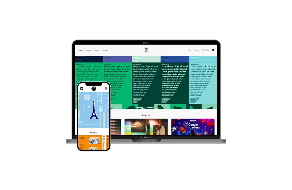
A portfolio website which effectively showcases the ‘Creative Artwork’ and ‘Graphic Design’ services of the designer.
The problem
An existing website needed to be redesigned and upgraded. Various problems were identified:
-
The site didn’t work on phones or ipads and was becoming outdated in it’s structure.
-
The site used SWF animations that were not compatible with some platforms and devices.
-
The images were small and the site felt ‘clunky’
-
It wasn’t clear if the designer was an exhibition designer or digital design and the designer wanted to expand his Creative Artworker role with his clients.

The goal
Create a new website that showcases the designers creative abilities as a designer and artworker. The site needed to stand out from a saturated crowd of creative artworkers chiefly because the designer was looking to expand his work as a creative artworker but also not dismiss new graphic design projects.
My role
Research
-
Researching the market to establish what was currently expected of a Creative Artworker’s site.
-
An audit of competitors (identifying typical Creative Artworker websites and current design trends). – Researching the target audience which are mainly recruitment agencies and design studios. Two recruiters were contacted and their feedback informed the direction of the design.
-
Researching the best technologies available at the time so that the website would be built on a secure platform which offered email, webspace, SEO capabilities, analytics and many other features. It had to work well on all platforms - phone, iPad, desktop.
Design
The design, build and testing.
Research
Primary research: questioning recruiters in two recruitment
agencies via email and phone conversation:
-
The work was good but wasn’t standing out
-
It wasn’t clear that I also did Creative Artwork
-
It looked like I was a exhibition designer
-
The site seemed a bit clunky and the images were small compared to other similar sites
Secondary research was also carried out:
-
Visual research
-
Competitor audits
-
Best technology research options for latest web standard site building.
-
User testing – asking questions as to identify pain points.
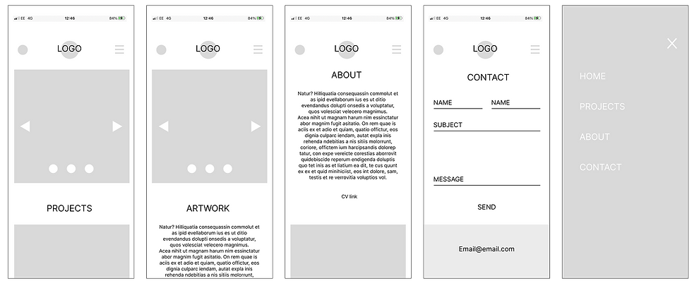
After the build of the site further research with recruiters was carried out and it became apparent that it needed more emphasis that the designer was providing two services - Graphic Design and Creative Artwork. An ‘Artwork’ button was added to the top main menu which takes to viewer to a separate Creative Artwork page. A slight redesign of the About page put more emphasis on the 2 services.
Pain points identified
-
The existing site was built in Dreamweaver with swf animations which were quickly going out of date. The users interviewed felt it needed a refresh.
-
The designer was limited in that he had some knowledge of CSS and HTML but didn’t have the capacity to build a new site from scratch by himself.
-
It wasn’t clear what sort of design work the designer was looking for. Some thought he was an exhibition and signage graphic designer. He wanted to get more Creative Artwork work.
-
Part of the site was starting to break because of the swf animation content and users couldn’t experience the animations on phones and ipads.

The initial new design had to make everything work for phone and desktop. All about making the images of the designers work well on all screens and maximise viewing size. The menu to reach everything would always be at the top within easy reach. Home, Projects, About and Contact being the initial channels to choose from.


Feedback
The Designer is receiving a lot more interest and work since the site was launched. Recruiters feedback is very positive and the
designer is kept very busy.


What’s next
The site was created for a specific audience but a lot of updates to the structure could be done to make the site more immediately understandable and useful to a wider audience. The site falls short on accessibility - this would need improvement.
Also clarity could be improved for the ‘cold caller’ so that when they reach the first page they know where they are and what services are offered instantly. (At the moment recruiters respond to an email to get to the site - so they have already understood what services the designer is offering)

