


Simplifying the Flight Booking Experience
My Role | Duration | Software Used |
|---|---|---|
Project Strategy | 4 months | Miro |
UX Research | Figma | |
UX Design | Slack | |
Presentation | Google docs | |
User testing | Zoom / Teams | |
Lovable / Various AI |
My Role | Duration | Software Used |
|---|---|---|
Project Strategy | 4 months | Miro |
UX Research | Figma | |
UX Design | Slack | |
Presentation | Google docs | |
User testing | Zoom / Teams | |
Lovable / Various AI |
Overview
Flyt is a speculative redesign of a flight-booking platform created to address real user frustrations found in industry-leading sites. The goal was to make booking faster, clearer, and more intuitive — cutting through the clutter that often overwhelms travellers in other popular sites.
I worked through all stages of the UX process, from discovery research to high-fidelity prototyping, using the double diamond design process.

The Challenge
Current popular flight booking sites can be bloated with offers, extras and unnecessary steps that can slow down a booking reducing confidence. The aim of this study was to look at a best case scenario 'happy path' through the booking process to see if it's possible to improve the experience for the user - removing confusion, reducing unnecessary steps, and guiding users seamlessly to purchase.
Key Discovery findings
Primary
-
Ambiguous CTAs & unclear, non descriptive, field labels caused user to pause, reducing user confidence.
-
Pop-ups and drop-downs often obscured the main search field, creating immediate friction.
-
Offers and ads sometimes were prioritised over the search for flights fields which led to friction with the user
-
Identical page layouts for outbound/return fares led to user confusion.
Secondary
-
No smart defaults — long time users were asked which country they were in and what language they would prefer. This let to frustration 'Why doesn't it know these things'
-
The extras pages caused mistrust and friction (“hidden fees?”).
-
Some sites didn't use a next steps guide leading several users to get stuck when selecting fare choices
-
User overwhelm on some pages because of too many choices / too much information on the page.
Finding a 'happy path' to improve service
Reduced clicks / simplified customer journey / removed clutter / site recognition / next steps guide throughout process / partial disclosure removed overwhelm / chunking extras page and fast track option
Created a booking app that:
-
Recognises the user from the start (using smart defaults etc)
-
Reduced clicks on the homepage search area, compared to British Airways, by 40%
-
Uses next step guides to focus the user on the happy path through the site.
-
Once field is filled the next field is automatically activated and if there is a drop down for that field it automatically appears without an extra click in the field
-
Uses a very focused minimal approach to design with strong, unambiguous CTA with descriptive titles. For example instead of the word 'Depart' title above the departure date field this choose the obvious word 'Dates')
-
An option to fast track through to payment
-
Minimal uncluttered design focuses on typical user goal
-
the extras area of the site offerings are hidden in tabs which can be bypassed quickly unless you need them.
-
The experience tells the user that the site is aligned with their need to get through the booking as quickly as possible

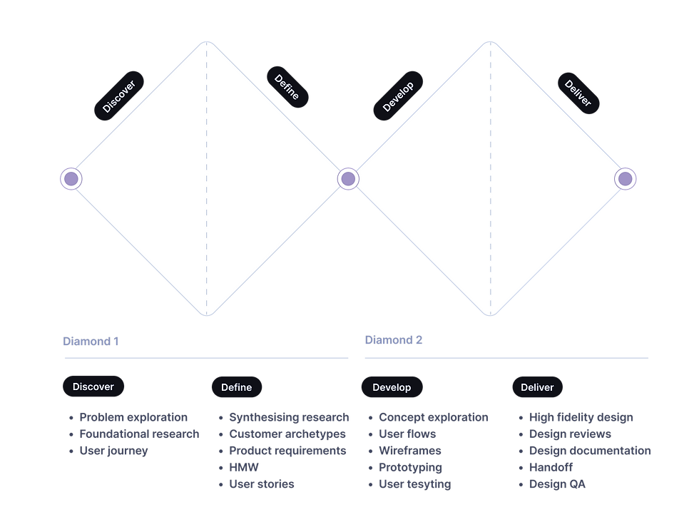
The Double Diamond Design Process
Finding things out
Discovery (Research)
To understand more about the potential problem that needed to be solved I conducted research to get a clearer picture of how to move further.
Research methods used:
-
Competitive benchmarking of major booking platforms
-
reviewing 6 of the most popular booking websites - this was very useful to discover pain points but also to understand current standards and conventions and observe what these sites were doing well.
-
-
Usability testing and note taking
-
scripting and conducting usability tests to observe and understand the users goals, behaviours, pain points as they went through the booking process an several key sites
-
-
Surveys
-
sent out surveys with qual and quant questions to get a clearer picture of any perceived pain points booking through several competitor websites
-


Making sense of my research into current state of popular flight booking sites
Synthesising research
I gathered findings and clustered data into themes identifying key insights and highlighting key recommendations and opportunities. I refined the scope to a list of key product requirements and opportunities. (feature prioritisation)
Methods:
-
I used Affinity Diagrams to make sense of the research and organise it into themes.
-
Empathy maps gave a clearer picture of key issues
-
Customer journey map was created as a point of reference for my refined key findings.
Key Painpoints 👎︎ :
Primary
-
Ambiguous CTAs & unclear, non descriptive, field labels caused user to pause, reducing user confidence.
-
Pop-ups and drop-downs often obscured the main search field, creating immediate friction.
-
Offers and ads sometimes were prioritised over the search for flights fields which led to friction with the user
-
Identical page layouts for outbound/return fares led to user confusion when next step page appeared (inadequate feedback).
Secondary
-
No smart defaults — long time users were asked which country they were in and what language they would prefer. This let to frustration 'Why doesn't it know these things'
-
The extras pages caused mistrust and friction (“hidden fees?”).
-
Some sites didn't use a next steps guide leading several users to get stuck when selecting fare choices
-
User overwhelm on some pages because of too many choices / too much information on the page.


A Customer Journey Map became the focus of the new design and was constantly referred to during the iteration process
Customer journey map was created as a point of reference for the refined key findings.

Affinity diagram converted data into themes to inform the key issues discovered with would help form the problem statement and solidify the data into a customer journey map
Some key, fixable, existing problems made me think of a booking process that was more personable, useful and communicated that we are working for our customer to get them the best deal for their goals.
-
Some problematic findings became a focus for designing a potential alternative to whats here already:
-
Users struggle to move confidently through flight booking flows due to cluttered interfaces, unclear guidance, unnecessary repetition, unclear CTAs and next steps, unclear focus on primary goal due to ads and offers, poor user recognition. Some offerings unclear.
Customer journey map was created as a point of reference for the refined key findings.

A flow diagram was created to work out the optimum journey through the booking process

New Design Focus
Exploring different design concepts based of the research findings I developed a simple flow through the booking process of a new booking site. Addressing the pain points discovered in the research I iterated ideas as to how to solve these.
Core design decisions:
Primary
-
Unneccessary pop ups and expanded menu's that obscure flow removed
-
Smart defaults: Auto-detect returning users and location settings to skip redundant steps.
-
Guided progression: Highlight “next step” fields with clear CTAs and visual feedback. Obvious next steps.
-
Minimal layout: No obstructive ads or drop-downs; focused purely on booking flow.
Secondary
-
Animated feedback: Smooth transitions signal task completion and progression.
-
Progressive disclosure: Show only essential information at each stage to reduce overload.
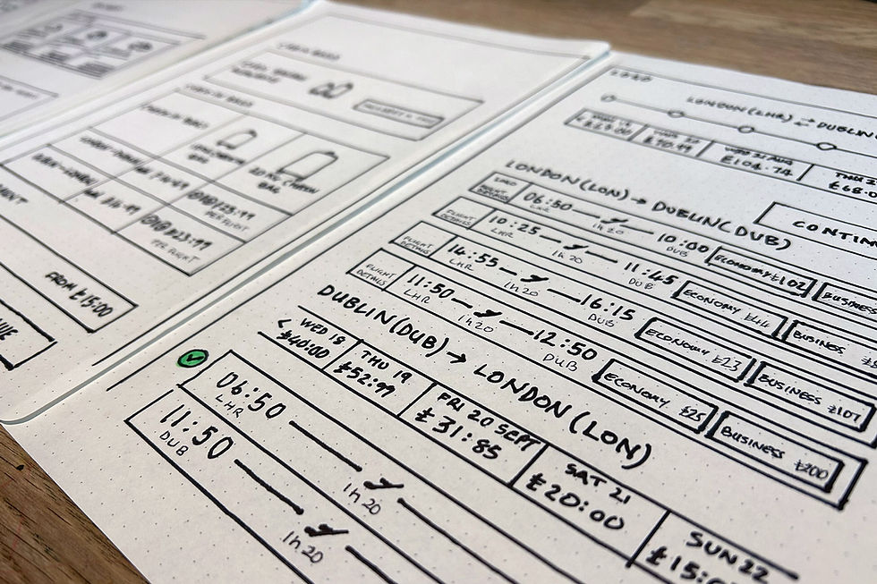
I then sketched out screens based on the ideal flow, iterating and refining these. I created wireframes to test how the user could go through the site.

Design ideas started with sketching out and iterating possible approaches based on the research and the flow diagram. Mid and High-Fidelity prototypes were then created.


From 11 clicks to 6

A typical search box (11 clicks on average)


Testing different approaches to the search box: This example, by selecting where you want to go first the site makes a best guess, based on smart defaults and previous searches, which airport you want to leave from, skipping steps. (this can be changed at any time). Getting through the search page in 5-6 clicks.
The site highlights the next step field and activates field drop down list when you complete the current field - helping guide the user through the booking process.


Using user recognition and assumptions flow starts at the 'Where to' field. Flyt uses minimum clicks through the search box process, guiding the user.


A flow diagram was created to work out the optimum journey through the booking process
Outcome
Using insights from my mid-fidelity prototype testing, I developed a high-fidelity prototype to validate usability and interaction flow. The design focused purely on a newly established 'happy path'. The site recognised the user, guides the user through the booking process with clear next steps and knocks back any unnecessary extra information. Extra selling points are easily passed unless you need them and the overall impression of the current design is a fast and useful site that knows you and is working for you to get yourself booked as easily as possible. The site is at an early stage and would need a lot more user testing to validate current assumptions and test whats useful or not. AI can be brought in to increase personability and usefulness. The experience I am looking for instils confidence in the user, is a delightful, useful and simple experience - getting the best flight deal and encouraging return custom.
Feedback indicated that users so far:
-
Found it easier to identify their next steps, identify CTAs and appreciated the fact that the site 'knew them'
-
found the process of booking a flight surprisingly easy and enjoyable
-
Completed the flow faster with fewer errors. They appreciated the increased convenience
-
The pared-back ad-free layout helped them focus (no distractions from the main task)
-
They were also interested in exploring deals off the main path which is an opportunity to further explore
The current prototype focuses on clarity and functional flow, setting the foundation for future usability testing, development and accessibility refinement..

Next Steps
-
Conduct usability testing to validate current assumptions of whats working for the user and the business owners.
-
Develop the design further based on customer feedback. The design is at an early stage and is open for next steo discovery
-
Ensure accessibility compliance (WCAG 2.2).
-
Explore integration of AI methods to make the experience as useful, delightful and as simple as possible.